
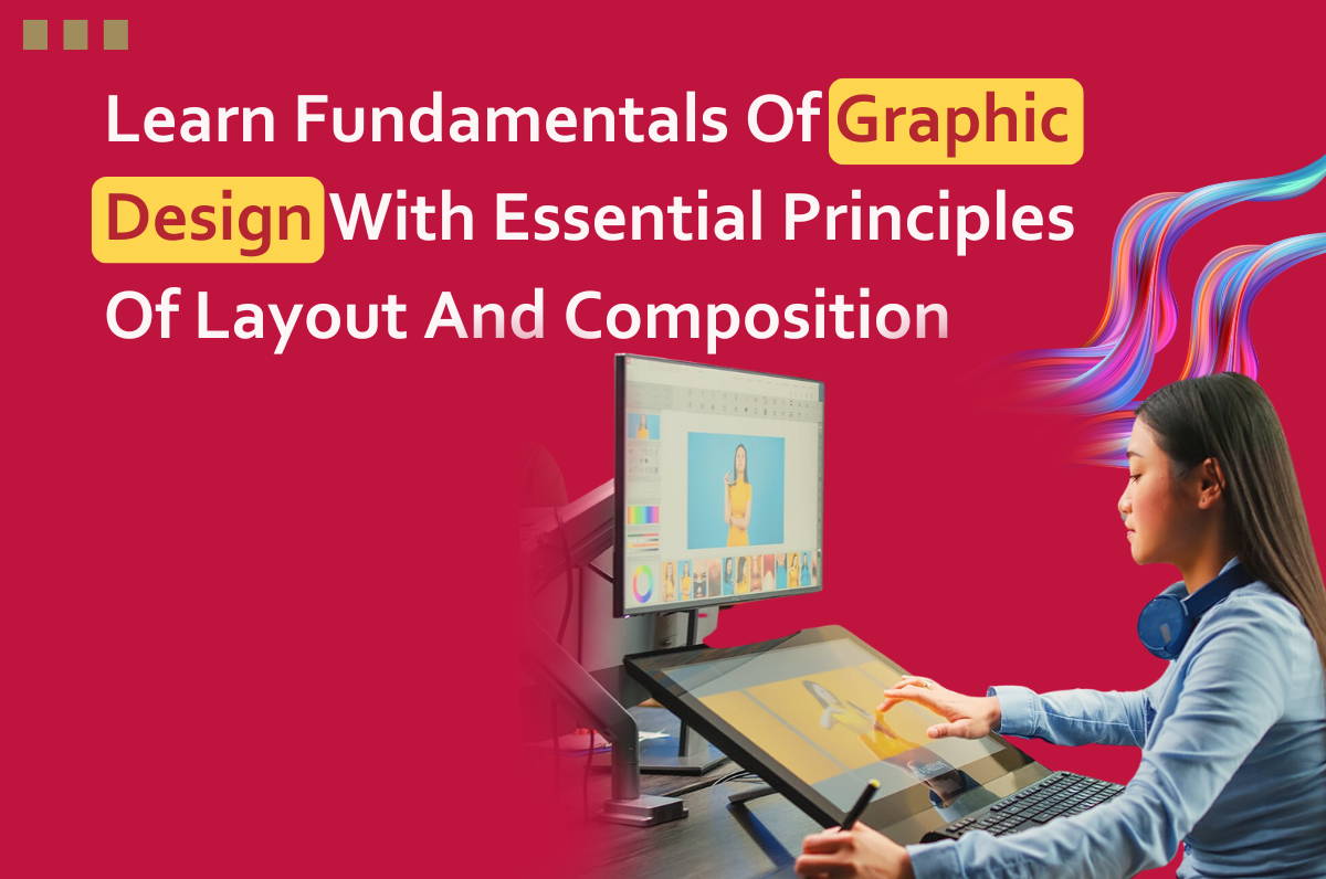
Graphic design is both an art and a science, requiring a deep understanding of visual communication principles, creativity, and technical skills. At the core of Incredible Point’s graphic design course lies each proper learning layout and composition, the arrangement of visual elements on a page or screen to convey a message effectively. In this blog, we’ll explore the essential principles of layout and composition at Graphic Design Courses Institute in Delhi provides a foundation for beginners and seasoned designers alike to create compelling and visually engaging designs.
Understanding Layout and Composition
Layout and composition refer to the organization and arrangement of visual elements within a design. It involves strategically placing elements such as text, images, and graphics to create a cohesive and harmonious visual hierarchy. Our Digital Marketing Course in Delhi helps you learn effective layout and composition not only attract the viewer’s attention but also guide them through the content logically and intuitively.
Importance of Visual Hierarchy
Visual hierarchy is a key principle in layout and composition, dictating the order in which elements are perceived and the emphasis placed on each. By manipulating factors such as size, color, contrast, and proximity, designers can control the flow of information and direct the viewer’s gaze to the most important elements first. Establishing a clear visual hierarchy ensures that the message is communicated effectively and that the viewer’s attention is captured and maintained.
Balance and Symmetry
Balance and symmetry play a crucial role in creating visually pleasing designs. Balance refers to the distribution of visual weight within a composition, while symmetry involves mirroring elements across a central axis. Achieving balance and symmetry in a design helps create a sense of harmony and stability, making it easier for viewers to engage with the content. However, asymmetrical designs can also be effective, adding visual interest and dynamism when executed thoughtfully.
Proximity and Alignment
Proximity and alignment are fundamental principles that help organize and unify visual elements within a layout. Proximity refers to the grouping of related elements, while alignment involves positioning elements along a common axis. By grouping related elements and aligning them with each other, designers can create a sense of unity and cohesion, making it easier for viewers to interpret the content and navigate through the design.
Use of Grids and Guides
Grids and guides are essential tools in graphic design, providing a framework for organizing and aligning visual elements within a layout. Grids help maintain consistency and structure across multiple pages or screens, while guides assist in positioning elements with precision. By adhering to a grid system and using guides to align elements, designers can create clean, organized layouts that are visually appealing and easy to navigate.
Typography and Readability
Typography plays a critical role in layout and composition, influencing the readability and visual impact of a design. Choosing the right typefaces, font sizes, and spacing is essential for conveying the intended message and establishing the tone and personality of the design. Additionally, designers must consider factors such as line length, line spacing, and text alignment to ensure optimal readability and legibility.
Embracing Negative Space
Negative space, also known as white space, is the space around and between visual elements in a design. While it may seem counterintuitive, negative space plays a crucial role in layout and composition, allowing elements to breathe and providing visual relief. By embracing negative space, designers can create designs that feel open, balanced, and elegant, enhancing the overall aesthetic and user experience.
Experimentation and Iteration
As with any creative endeavor, experimentation, and iteration are essential aspects of mastering layout and composition in graphic design. Designers should not be afraid to explore different approaches, test ideas, and refine their designs through multiple iterations. By continuously experimenting and refining their skills, designers can develop their unique style and approach to layout and composition, ultimately creating designs that resonate with their audience.
Conclusion
Layout and composition are foundational principles in graphic design, shaping the way information is presented and perceived by viewers. By understanding and applying essential principles such as visual hierarchy, balance, proximity, alignment, typography, negative space, and experimentation, from our Graphic Design Course in Delhi designers can create compelling and visually engaging designs that effectively communicate their message. Whether you’re a beginner or a seasoned designer, mastering the fundamentals of layout and composition is essential for success in the field of graphic design, so join us to enhance your skills. For more details, visit our website.
FAQs
What is layout and composition in graphic design?
Layout and composition refer to the organization and arrangement of visual elements within a design, such as text, images, and graphics, to effectively convey a message.
Why is visual hierarchy important in layout and composition?
Visual hierarchy dictates the order in which elements are perceived and the emphasis placed on each, guiding the viewer’s gaze and ensuring that the message is communicated effectively.
How do balance and symmetry contribute to visually pleasing designs?
Balance and symmetry create a sense of harmony and stability in designs, making it easier for viewers to engage with the content and adding visual interest when executed thoughtfully.
What role do proximity and alignment play in layout and composition?
Proximity groups related elements together, while alignment positions elements along a common axis, helping to create unity and cohesion in designs for easy interpretation.
Where can I learn more about mastering layout and composition in graphic design?
You can enhance your skills and knowledge by enrolling in a comprehensive Graphic Design Course like the one offered by Incredible Point, where you’ll learn from industry experts and gain hands-on experience in applying these principles to real-world projects.